Most of the techniques I used I already knew about, and this shows, as I didn’t previously know about too many different techniques. The two pages, the title and contents, look quite flat. It would have been nice to have made them look slightly more shiny and 3d, while instead the color’s are block colors and the text very flat.
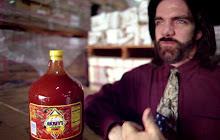
I did however learn how to blend color’s and images. Originally, the image had a very sharp line with the background, which looked rough and unprofessional. I covered the harsh line with words, and the bar code, to draw attention away from it. However, the barcode needs a white background for scanners to read it, and when a white background was added to the barcode, it drew extra attention to the harsh line. So I learnt how to make a slight blend from the image to the background, a gradual change. It ties the image in with the magazine and makes it look less super-imposed.
Also, I could then move the barcode to the bottom corner, a more conventional place which made it look significantly neater, and more like a magazine.
We had a website designer come to give us constructive criticism. She pointed out that the text was primarily one size. Although it didn’t make the text flashy or 3d, when the size was varied it did make it look less flat. It also enabled the importance of the different cover stories to almost be ranked in size, as the more important, audience attracting stories’ text was made larger and more central to draw attention to them.
She also commented on how having the cover photo take up half the front cover meant the cover could be perceived as though two separate halves. Moving the image down and adding the magazine’s tag line above tied the magazine together.
Subscribe to:
Post Comments (Atom)
No comments:
Post a Comment